
























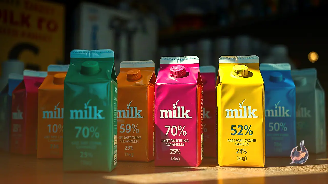

A visit to any local grocery store or milk booth reveals an array of pouches sporting distinct hues such as orange, green, blue, and magenta. While everyday shoppers often dismiss these vivid borders as cosmetic branding decisions, dairy producers deploy them strategically to denote specific milk categories and processing standards. In practice, this color coding functions as a visual shorthand for the fat percentage inside, allowing buyers to select their desired variety without scouring every line of fine print, though conventions can occasionally differ from brand to brand.
Orange Pouches and the Richness of Full Cream Milk
In dairy retail, an orange pouch traditionally identifies full cream milk, which contains approximately 6 percent fat. This substantial fat content lends the milk a rich, dense consistency and a naturally creamy texture. Households frequently reach for this variety when preparing traditional sweets, simmering slow-cooked kheer, setting thick curd, or churning homemade ghee. Consumers who favor a full-bodied mouthfeel and traditional creaminess invariably choose this rich formulation for specialized kitchen preparations.
The Balanced Everyday Profile of Green Packets
Green packaging is widely adopted across multiple dairy companies for standardized milk, offering an intermediate fat profile of around 4.5 percent. This category strikes a functional middle ground, being neither excessively heavy like full cream nor thin like skimmed variants. Because of this versatile equilibrium, green pouches are exceptionally popular for brewing daily cups of tea and coffee, as well as serving as an everyday drinking option for both children and adults.
Blue Packaging for Toned Milk Varieties
A blue wrapper almost universally signals toned milk, formulated with roughly 3 percent fat content. This variant caters specifically to consumers seeking to scale down dietary fat without sacrificing the familiar taste and texture of natural cow or buffalo milk. It provides a lighter alternative that integrates smoothly into breakfast cereals, beverages, and light cooking routines without imparting the heaviness associated with richer options.
Magenta and Pink Hues for Double Toned Milk
Certain dairy brands allocate pink or magenta packaging to their double toned milk lines. This specific classification limits the fat concentration to roughly 1.5 percent, resulting in a very light liquid consistency. It appeals directly to individuals monitoring their fat consumption or looking for an ultra-light dairy source to fit restrictive nutritional preferences while managing routine calorie intakes.
Does Packaging Color Guarantee Purity or Quality?
A common misconception among shoppers is that certain colors represent superior grade, fresher stock, or higher purity. In reality, packaging color relates purely to fat quantification and processing categories, offering zero indication of underlying product purity or overall processing hygiene. Furthermore, because universal standardization is not strictly mandatory across all independent dairies, packaging schemes can vary. Shoppers should examine the printed nutritional facts panel, designated fat percentages, and official category certifications on the pouch rather than relying exclusively on color cues.