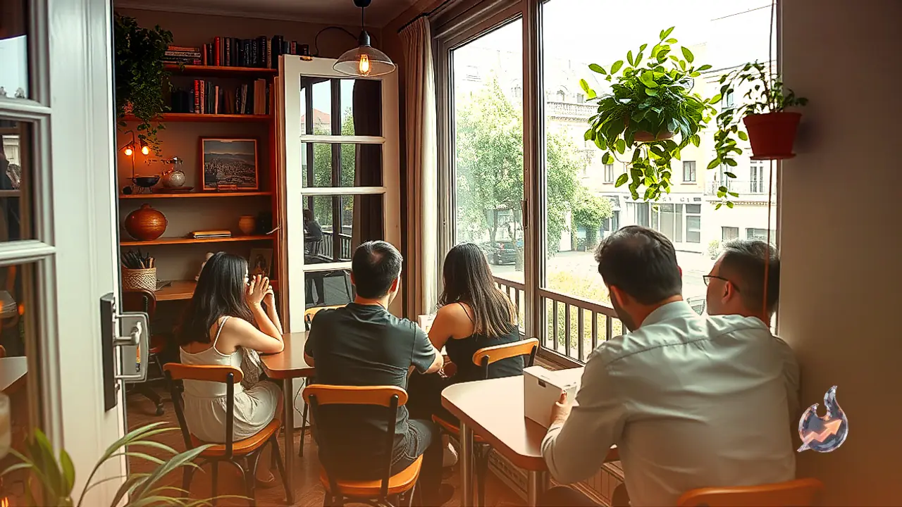


























For decades, conventional wisdom in interior styling dictated that living spaces needed to adhere to strict uniformity, with couches, drapery, accent pillows, and tables adhering to the same palette and fabric family. Investing in uniform furniture suites straight from showroom displays was long treated as the gold standard of refined taste. Today, however, that rigid design philosophy is undergoing a notable shift. Rather than leaning on identical shades and repeating patterns, a growing number of homeowners are curating spaces that bring together disparate prints, distinct color stories, and contrasting design eras. Known widely as mismatched decor, this expressive interior trend has gained considerable momentum through online design communities and glimpses into celebrity residences.
At first glance, setting intentionally dissimilar furnishings beside one another might feel unconventional. Yet when executed with care and deliberate restraint, this approach infuses an interior with welcoming warmth, character, and an authentic lived-in charm that cookie-cutter arrangements rarely achieve.
The Core Philosophy of Intentional Contrast
Embracing a mismatched interior is fundamentally different from filling a room with arbitrary or cluttered items. The genuine art of this concept relies on curating contrasting elements so that while each piece maintains its individuality, the collective space feels cohesive rather than chaotic. The goal is visual distinction without visual disorder.
In a standard living area, this principle might mean trading four identical cushion covers for an assortment of complementary patterns, weaves, and tones. Around a dining table, rather than buying a matching set of identical chairs, two distinct statement chairs can be introduced at the heads of the table. Similarly, pairing an ornate vintage wooden credenza with a sleek modern dining surface creates a layered dynamic that gives the entire room depth and maturity.
Inspiration Drawn from Celebrity Living Spaces
The private residences of prominent public figures, artists, and creators have long functioned as mood boards for interior design enthusiasts. As informal snapshots of their living rooms, reading nooks, and studios circulate across digital platforms, onlookers frequently notice how thoughtfully their lighting, seating, and wall art diverge from standard catalogue styling. In these homes, furnishings are treated as individual expressions rather than uniform packages.
This distinct aesthetic holds broad appeal. A cherished mid-century armchair can sit comfortably beside a contemporary glass and steel coffee table, just as handcrafted ceramic pottery or handwoven textiles can coexist effortlessly with minimalist, industrial architecture. The room becomes an evolving gallery of curated favorites rather than an off-the-shelf staging.
Eviscerating Matching Pressure While Honoring Memories
Perhaps the most liberating advantage of this styling direction is that it eliminates the financial and mental strain of chasing absolute perfection. Revitalizing a living room no longer demands liquidating functional, high-quality furniture simply because a single piece does not match the rest of a newly bought set.
An antique floor lamp passed down through generations, an eclectic accent chair picked up from an artisan market, or decorative artifacts gathered during distant travels can all find a natural place within a refreshed layout. An interior styled this way feels intimately human, directly reflecting the distinct tastes, milestones, and travels of the people who inhabit it, standing in sharp contrast to the sterile ambiance of traditional matched showrooms.
Working with Color Palettes and Connecting Threads
When assembling a room with varied elements, color discipline becomes the most crucial balancing mechanism. If an interior already features prominent, vibrant hues across walls or dominant upholstery, keeping additional decorative accents relatively subdued and neutral prevents sensory overload.
For instance, an understated sofa in cream, beige, or soft grey provides a versatile canvas for smaller throw cushions rendered in mustard yellow, forest green, and navy blue. When working across diverse colors, a reliable designer tactic is to repeat a single key hue across two or three separate zones within the same space. Echoing an accent shade from a wall canvas in a ceramic vase across the room establishes a subtle visual bridge that ties different objects together.
Simple Ways to Introduce the Look Gradually
Adopting this layered design language does not require an overhaul of major furniture or an exorbitant renovation budget. The transition can be executed seamlessly through small, modular adjustments. Swapping cushion covers, curating an eclectic gallery wall with varied frame finishes, rotating vases, or introducing alternate table lamps are manageable entry points.
In dining rooms with a six-chair setup, one does not need to discard the entire arrangement; simply replacing the two end chairs with distinct designs or materials instantly breaks the monotony. Within bedrooms, layering bed linens with throws of contrasting knits and cushions featuring contrasting geometric prints delivers an immediate refresh without replacing bed frames or dressers.
Avoiding Clutter Through Thoughtful Restraint
Combining varied aesthetic elements should never be mistaken for overcrowding a room. Piling an excessive volume of conflicting patterns, loud colors, and knick-knacks into a single room will quickly make the environment look messy rather than stylish.
To maintain sophistication, every room requires a clear unifying anchor. This thread can be an overarching color family, a recurring material such as warm timber or brushed brass, or a shared silhouette across different furnishings. That underlying consistency keeps the space structured, allowing each unique piece of decor to stand out on its own merits.