

















The next time you glance at a world map, look twice, because the version most of us grew up with is on its way out. Nothing is shifting on the ground, no border is moving and no country is losing an inch of territory, but on paper the proportions of the planet are set for a major correction after the United Nations agreed that the map hanging in classrooms, printed in atlases and built into phone apps has been distorting the world for roughly four and a half centuries.
The vote in New York
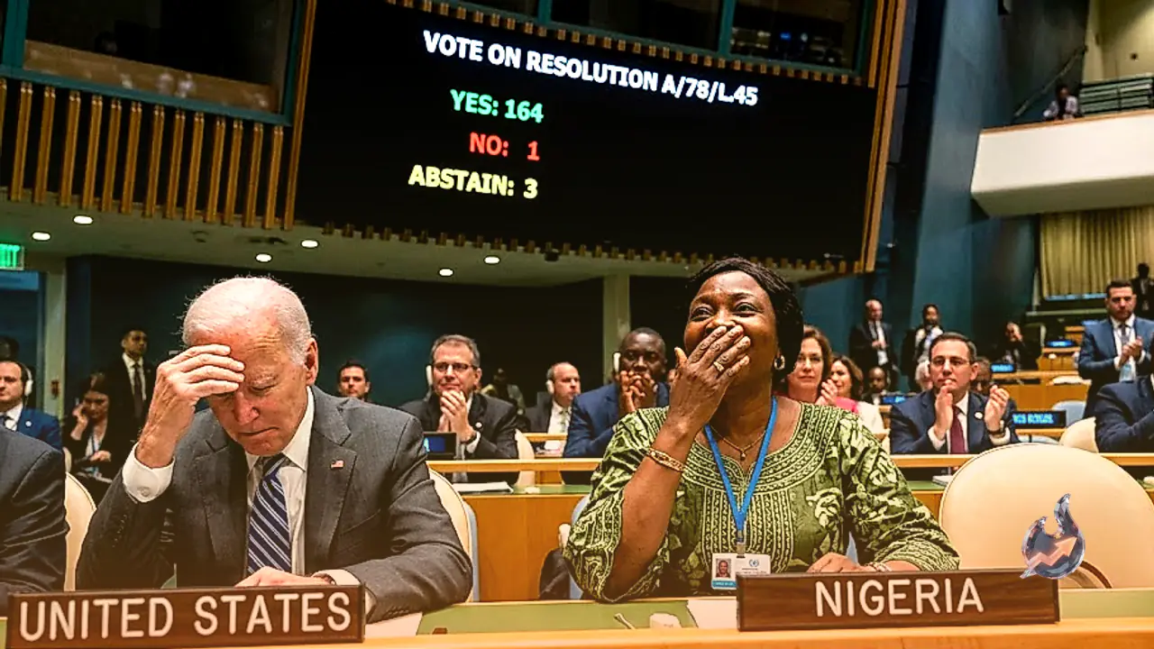
The push to retire this map, formally known as the Mercator projection, came to a head at the UN General Assembly in New York. A resolution calling for the world to move away from the old projection was put to a vote, and 164 countries backed it. The United States was the only country to vote against the change, while six countries chose not to take a position either way. Passing a resolution at the UN does not force any single country to switch overnight, since there is no rule dictating which map a school or government must hang on its wall. But a UN-backed resolution carries weight, it opens the door for schools and colleges, official government paperwork, international organisations and even the mapping tools built by technology companies to start adopting a corrected version instead of the one everyone has used since childhood.
Where the complaint started
The controversy did not begin at the UN, it began with African nations pointing out something that had bothered them for years, the standard map makes Africa look smaller than it actually is, squeezing and flattening a continent that is, in reality, enormous. The African Union ran a campaign around this complaint, Togo formally carried the resolution to the UN General Assembly, and France backed the push. Their argument went beyond aesthetics, a map is not just a piece of paper, they said, it settles into how people picture the world in their heads. A distorted map quietly shapes assumptions about which regions matter, which look big and important and which look small and marginal. That argument fed into an online push under the hashtag #correctthemap, where people pointed out that the United States, China, India, Japan, Mexico and a large chunk of Europe could all be placed inside Africa's outline and there would still be room to spare, something the familiar map never lets you see.
Why a flat sheet of paper can never get a globe right
To understand why the map ended up this way, it helps to think about the basic problem cartographers were always up against, the Earth is round like an orange, but a map has to be flat. Peel an orange in one piece and try to lay that peel flat on a table, and it will tear apart at the top and bottom while the middle, where it curved out the most, holds its shape reasonably well. Something similar happens when you flatten a map of the globe. Around the equator, where the planet bulges out the most and where Africa happens to sit, the shapes stayed close to accurate. But countries further from the equator, stretching up toward the North Pole, had to be pulled and stretched to fill the flat sheet, and that stretching is exactly what makes Russia, Greenland and Canada look so oversized.
The Flemish mapmaker behind the lines
The specific version of the flat map that spread around the world traces back to one man, Gerardus Mercator, a Flemish cartographer who drew it in 1569, which is why it is still called the Mercator projection today. He was not trying to represent every country's true size, he was solving a navigation problem. Ships heading out to sea needed the shortest, most direct route to their destination, and Mercator's projection allowed sailors to draw a single straight line on the map and follow that exact compass bearing to arrive where they intended. For sailors and ship captains, that made it an extraordinarily useful tool, and it is precisely why the map spread so widely, ending up on classroom walls, printed inside textbooks and eventually built into modern tools like Google Maps.
How far off the sizes really are
The trouble is that the same projection that made compass navigation simple also badly distorts how big countries appear, and the distortion gets worse the further you move from the equator. Greenland, for instance, appears on the standard map to be roughly the same size as Africa, when in reality Africa is about fourteen times larger than Greenland. Europe and North America both look inflated, Russia and Canada are stretched out well beyond their true proportions, while Africa, Latin America and the countries sitting close to the equator end up looking smaller and more compressed than they actually are. Put another way, the map has spent four and a half centuries convincing readers that the northern hemisphere carries more landmass than it does, while continents nearer the equator quietly lose ground on paper even though they lose nothing in reality.
What happens from here
The map was originally built to solve one specific job, helping ships find direction at sea, but over time it became the default picture of the world that ended up everywhere from geography lessons to news broadcasts. With the resolution now passed at the UN General Assembly, no country is being compelled to swap out its maps immediately, and the United States has already signalled it does not support the change. Even so, the vote sets the stage for schools, colleges, government departments, international institutions and the technology companies behind digital maps to gradually shift toward a version that reflects the true scale of countries like Africa, rather than the four-hundred-and-fifty-year-old projection built for sailors that the world has been looking at ever since. For anyone who has used a paper map, studied geography in school, or simply looked at a world map on a wall, the switch means the picture in front of them may finally match the planet it is supposed to represent.