


















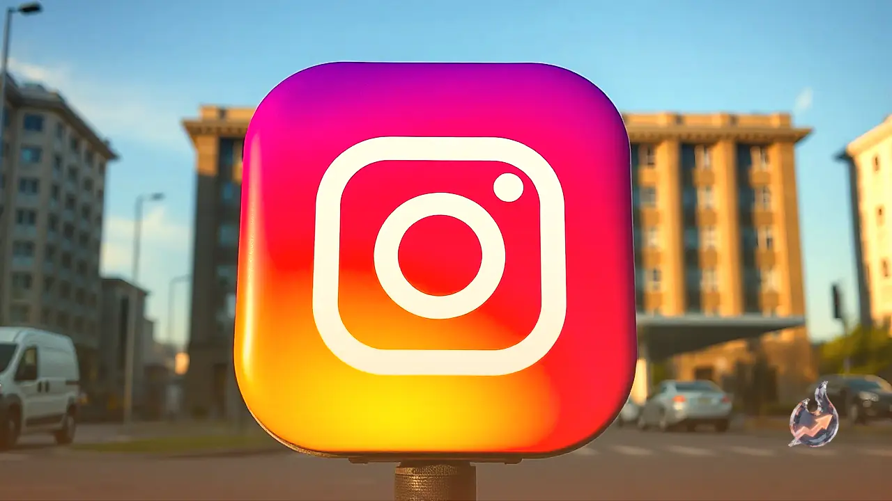

Popular photo and video sharing platform Instagram has officially introduced a redesigned wordmark across its app interface, marking its first major typography update in ten years. The subtle visual makeover was announced by Instagram chief Adam Mosseri through posts on both Instagram and Threads. While the app's iconic gradient camera icon remains completely unchanged, the stylized text branding located at the top of the mobile interface has been given a refined look designed to make the platform appear more modern and polished.
Modernizing the Classic Script Typography
According to statements shared by Adam Mosseri, the primary objective behind the refresh was to enhance the clarity and sharpness of the platform's signature header text. The redesign retains Instagram's recognizable cursive script style while carefully re-engineering the shape, contours, and spacing of the individual letters. Mosseri highlighted that the new typography is cleaner and more contemporary, striking a careful balance between modern visual standards and the original simplicity that defines the brand.
This update represents the most notable adjustment to Instagram's visual identity since 2016. Eight years ago, the platform underwent a dramatic redesign when it phased out its vintage brown camera icon and introduced the current colorful gradient logo. Unlike that 2016 overhaul, Meta's latest change is strictly confined to the text wordmark and does not alter the colorful camera badge or core navigation elements of the user interface.
Internet Reaction and Debate Over the Letter 'r'
The rollout of the new wordmark has sparked widespread discussion among users across online platforms, leading to divided opinions. A portion of the community embraced the update enthusiastically, sharing supportive comments such as "love this" and praising Meta for providing a sleek, modern upgrade to the interface. These users noted that the sharper lettering blends seamlessly with modern mobile operating systems.
Conversely, a significant segment of online commentators expressed skepticism regarding the aesthetic change. Several critics characterized the revised font as looking synthetic or "AI-generated," claiming that it lacks the warmth of the original script. The main focus of online humor and criticism centered on the newly sculpted lowercase letter 'r'. Many users observed that the modified curvature of the letter alters its visual reading, causing the brand name to look strikingly like "Instagzam" at first glance.